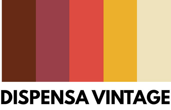
Vintage Colors: 3 Palettes to Use for a Retro and Refined Look
Introduction to Vintage Colors
Decorating with vintage colors evokes a sense of nostalgia and timeless style, capable of transforming any space with their retro charm. Color palettes inspired by the 50s, 60s and 70s not only add character to a space, but also create a welcoming and sophisticated atmosphere. Whether you are decorating a room or renovating an entire space, knowing and knowing how to use vintage colors can make all the difference.
Why Choose a Vintage Palette
Back to the Past with Style
The appeal of vintage colors lies in their ability to bring to mind past eras, rich in personality and style. These shades not only decorate, but tell stories of decades in which interior design merged with artistic expression. Choosing a vintage palette means embracing a look that is both elegant and rich in history, ideal for those who want a warm and welcoming atmosphere.
Versatility and Timeless Combinations
Vintage palettes are incredibly versatile, able to adapt to a variety of decor styles, from classic to modern. By combining colors like sage green, dusty pink, and mustard, you can create spaces that not only appear polished and cohesive, but that also resist passing fads. Exploring these color combinations will allow you to experiment with shades that, while rooted in the past, are incredibly current.
How to Use Vintage Colors in Home Decor
Incorporating vintage colors into modern decor is easier than you think. You can use a vintage palette as a base and add contemporary touches with clean, minimalist furniture designs. Alternatively, you can keep modern decor neutral and add colorful vintage accessories like rugs, vintage signs , or artwork to add character and depth to the space.
Palette 1: 70's Earth Tones
Main Features
The first palette draws inspiration from the 70s, a decade dominated by warm, earthy colors such as brown, burnt orange, and moss green. These colors reflect the growing interest in nature and the desire to create environments that reflect a return to simplicity and earth. These deep, enveloping shades are perfect for creating a relaxing and welcoming atmosphere.
How To Use This Palette
For a balanced look, pair brown with lighter tones like beige or cream. Burnt orange can be used for accents, like pillows or artwork, while moss green lends itself well to natural elements like plants or fabrics. When combined, these colors create a cocooning effect that invites relaxation and comfort.
Related Products
Consider pairing this palette with vintage furniture pieces available on Dispensa Vintage, such as moss green velvet armchairs or earthy-toned rugs that can perfectly complete the look.
Palette 2: Pastel Tones of the 50s
Main Features
The 1950s were a time of rebirth and optimism, reflected in a palette of pastel colors such as antique pink, powder blue and cream yellow. These colors, delicate and bright, evoke a sense of freshness and playfulness, perfect for creating airy and light spaces. The pastel palette is ideal for those who want an environment that inspires serenity and sweetness.
How To Use This Palette
Dusty pink can be used as a main color for walls or large surfaces, while dusty blue is suitable for details such as curtains, rugs or bed linen. Cream yellow can be used for smaller accents, such as pillows or lamps, to add a touch of warmth and brightness. This combination is perfect for bedrooms or living rooms where you want to create a cozy and intimate atmosphere.
Related Products
To complete this palette, explore the collection of vintage items on Dispensa Vintage, where you can find 50s-style table lamps or mirrors with pastel-colored frames.
Palette 3: Vibrant Colors of the 60s
Main Features
The 1960s were a time of great experimentation and cultural revolution, reflected in a palette of vibrant and bold colors such as red, mustard yellow, and cobalt blue. These bright and dynamic colors are perfect for those who like to dare and want to create energetic and stimulating environments. A 1960s-inspired palette adds a touch of eccentricity and fun to any space.
How To Use This Palette
Red can be used for accents like armchairs or artwork, while mustard yellow can dominate walls or fabrics like curtains and rugs. Cobalt blue, when used sparingly, can add depth and contrast, ideal for details like pillows or small decorations. This combination is perfect for creative spaces like studies or living rooms, where liveliness is at home.
Related Products
Pairing this palette with iconic pieces like chairs or coffee tables available on Dispensa Vintage can help you create an environment that embodies the bold spirit of the 60s.
Conclusion: Choose Your Ideal Vintage Palette
Vintage color palettes offer a wide range of possibilities to transform any space into a welcoming and stylistically rich environment. Whether you prefer the earthy tones of the 70s, the pastels of the 50s, or the bright colors of the 60s, there is a perfect combination for every taste and style. Explore the possibilities, experiment with colors, and be inspired by past eras to create a unique and personal environment.


